
Concept design
Fact-checking app

Context
The problem in short
Fake news is putting global democracies in crisis. According to “Measuring the news and its impact on democracy”, by , , and his happens despite less than 1% of regular news consumption and less than 1/10th of 1% of overall media consumption could be considered fake. Even the heaviest consumers of fake news (the 55+ age group) consume less than 1 min of fake news per day on average, compared with 106 min of regular news (94 of them on TV) and over 500 min of total media consumption.
Fake news conditions democratic elections. Too often, they are used during elections campaigns to convince swing voters to change their minds about a party or a person.
According to Fivethirtyeitght.com, in the 2016 US elections, there were about ten million swing-voters. That’s not a lot of people, but these voters probably played a role in helping Donald Trump get elected. Thanks to his fake-news campaigns around three-quarters of those voters swung toward him rather than Hillary Clinton.
The brief
We want to provide users with a tool to analyze pieces of news. We aim to give them a baseline to decide whether the news is fake or not.
Team
- Giuseppe – Product Owner
- Eli – Branding & Marketing
- Gert – Front & Backend Developer
- Andrea – Backend Developer
- Roberto – Backend Developer
- Simone – UX/UI Designer 👈
Process
We used the Triple Diamond flow (Research, Ideation, Prototyping&Testing) together with a Participatory Design approach that included all the team from the beginning.
Research
Desk research, surveys, UX interviews, mind mapping, user personas
Ideation
Brainstorming, Empathy and Journey Mapping, Concept
Prototyping
User flows, Wireframes, Hi-fi Mockups
Design Kickoff
01. Research
Desk Research
We have done desk research on the relation between fake news and digital users.
According to statista.com, we have seen that only the 29% of US adults trust news media. In Italy, 40%. The main motivations of trust are: being familiar with how independent and unbiased a news website or app is (46%), recognizing the person or organization that wrote or created news (43%), other websites give the same information (43%).
We have seen that +55 y.o. (mostly living in the suburbs or in the country) have fewer “antibodies” against fake news. In “‘Fake news’: Incorrect, but hard to correct. The role of cognitive ability on the impact of false information on social impressions”, by Jonas De keersmaecker, and ArneRoets (Department of Developmental, Personality and Social Psychology, Ghent University, Belgium), individuals with lower levels of cognitive ability tends to have more difficulties to adjust their judgment after they learn that their initial evaluation about information was based is incorrect. Moreover, this remains after the explicit disconfirmation of the false information. The results indicate that the initial influence of incorrect information cannot simply be undone by pointing out that this information was incorrect.
According to “Fake news and COVID-19: modeling the predictors of fake news sharing among social media users” by Oberiri Destiny Apukea, and Bahiyah Omara, altruism inside social media communities is the most significant factor that predicted fake news sharing.
Finally, in “Social Media and Fake News in the 2016 Election”, by Hunt Allcott and Matthew Gentzkow, we see that fake news is extremely dangerous for our democracy because of its polarization power. People are much more likely to believe stories that favor their preferred candidate, especially if they have ideologically segregated social media networks, and this would increase the hostility between the factions.
Surveys
We ran a survey to investigate +55 y.o. users with lower cognitive ability to explore their habits in gathering news, both in Italy (54 respondents) and the U.S (32 respondents).
We have found out most of them feel like they are on point about politics and conspirations. Some of them felt like activists, and once they trust a source (could be a friend, a blog, an influencer, or a Media Company), they re-share content in chat groups on Whatsapp (Italy) or iMessage (U.S.). Most of them just read the title. Reading the whole article could be boring, and they feel like they got the point after a few lines of text.
They mostly use their smartphone.
They trust more journalists-influencers that support their political party.
UX Interviews
We had personally interviewed them. They told us they associate reading the news with these emotions: affinity, trust, fear, and rage.
They experience a rapid transition between them every day, and they feel that this exposes them to being more instinctive (and less thoughtful) in sharing.
They said that they would not trust an app or a website that would tell them if a piece of news is real or fake (this would just make them more suspicious).
They would be interested in a tool that supports them in identifying the pillars of fact-checking to make it quicker and easy to use.
Mind mapping
Then we mind mapped all the information:


User Personas
We converged all this information in two user persona:


Political color analysis
We analyzed the relationship between colors and political movements in history, to design a brand with fewer political implications, and as neutral as possible for users:
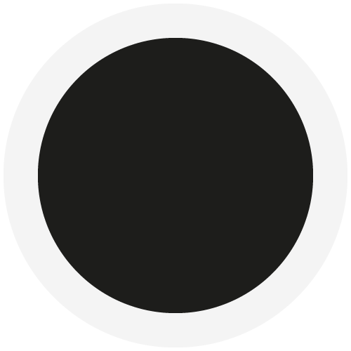
Black
Universal anarchism
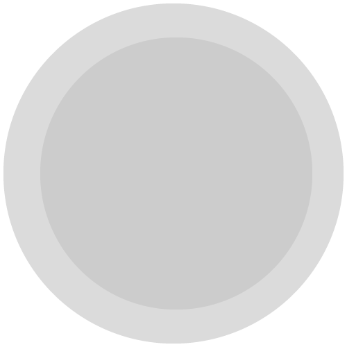
Grey
Senior citizens

White
Mainly pacifism
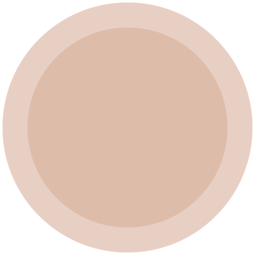
Buff
Current political left in UK
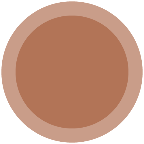
Brown
Nazism and fascism
Red
Socialism and comunism
Orange
Christian democratic
Saffron
Hinduist movements
Yellow
Liberalism (in the past)
Green
Environment
Blue
Conservative parties
Purple
Monarchism (in the past)
Magenta
Liberal and centrist parties
Pink
Support of civil rights
Purple and yellow have fewer political implications, and they would appear more neutral for our audience. [source: Wearing your Politics on your Sleeve: The Role of Political Colours in Social Movements]
Design Strategy
After the research, we defined the Design Strategy. It came up clearly that we needed to diverge to come out with fresh concepts. We agreed in developing a complete mockup of the experience only after a good conceptualization.
02. Ideation
Brainstorming workshop
At first, we had a remote brainstorming workshop. We made a hypothesis about a journey of fake news sharing, then we highlighted the problems and asked the team to brainstorm on how to solve them. Then we voted the ideas.

After the workshop, I worked on these outputs to define the user journey of our service.
Journey and Empathy Mapping
Then we designed the user journey. We mapped each step with possible users’ emotions and thinkings.
We identified these main steps:
1. Awareness
“This news is suspicious/Could this be true?”
2. Discovery
“How this app can help me to get more information about this article?”
3. Checking
“I want this to be fast and simple. I don’t want to loose my time”
4. Analyze
“I want to have immediate feedback but don’t tell me if it’s true or fake”

5. Sharing
“I want to help my community and friends by sharing the report”
Fake news is a sensible and subjective topic, that’s why we put so much focus on personal thoughts.
We need to build trust with users from the very first moment, so we agreed not to give them a result as “fake” or “real” but a list of KPIs with a clear score. Our purpose is not to convince them but put them in control to decide.
Problem reframing
Thank to these steps we reframed the problem like this:
“How might we allow users to easily check the reliability of a piece of news and report that to the community? How might we give them the right information that allows them to decide whether the news is fake or not?”
Concept
We wanted to build a Fact-Checking Report Creator to easily check:
Related news, or topics
Opinions of reliable fact-checkers
Reliability of the address link
Emphasis or grammar error on writing
Quotes on books, articles, and posts
03. Prototyping
Then we designed the experience. To do that we designed User Flows and Wireframes. After that, we had a first-round of internal user testing about a couple of solutions. Then we defined the UI Design and user-tested the prototype.
App navigation:

Report Creation UX

Result
The prototype app was presented to the Product Team.
This approach helped the whole team to optimize the resources and to give a common target to reach in the shortest time.
Visual synthesis helps cross-functional meetings and eases the participatory design process.
Want to see the whole portfolio?
It includes confidential material. Drop me an email at poli.simone09@gmail.com or hit me up on LinkedIn. I will be happy to talk about it together.